• Portfolio
  • Sketchbooks
    • Sketchbook 58 - PNW Roadtrip
    • Sketchbook 57 - USK Porto
    • Sketchbook 56
    • Sketchbook 55
    • Sketchbook 54
    • Sketchbook 53
    • Sketchbook 52
    • Sketchbook 51
  • Instagram
  • About
  • Contact
Jennie Kessinger
  • Portfolio
  • Sketchbooks
    • Sketchbook 58 - PNW Roadtrip
    • Sketchbook 57 - USK Porto
    • Sketchbook 56
    • Sketchbook 55
    • Sketchbook 54
    • Sketchbook 53
    • Sketchbook 52
    • Sketchbook 51
  • Instagram
  • About
  • Contact

New Craftsy Classes

Craftsy has been having a Black Friday sale - all of its classes are $17.99 or less through this Monday. I took the plunge and signed up for 2 more classes because I couldn't resist (again!). On Friday, I bought Matt Rota's Portraits in Watercolor class and watched through all the lessons over a couple of days while being holed up in Lake Tahoe with my family. ​

​Matt's course is excellent. Very, very thorough. He starts with materials and goes on to explain how to do different watercolor washes. I learned so much. For example, he showed us how hot press watercolor paper allows for the watercolors to stay wet longer than cold press which allows for easier mixing of colors and washes. He also explained how different washes and techniques allow for hard or soft edges and when you might want to use either in your paintings. 

He then shows us how to do a tonal study of a portrait using a single watercolor in different strengths to understand the light, middle, and darkest darks of your painting. I've been struggling to understand values so this was very helpful. ​Here is our reference photo and my tonal study. 

Reference photo. 

Reference photo. 

My tonal study  

My tonal study  

Then, we moved onto working on the portrait for the class starting with a light underpainting in either raw or burnt sienna using accurate measurements with your paintbrush or by eyeing how he features line up with other features. Matt explained how using a warm color for the underpainting allows you to cool it down later and for the underpainting to disappear under the final painting. He also recommended doing an underpainting instead of using graphite to avoid fussing and erasing. I liked that! 

Then, we went onto adding color. First, we made a background wash of ultramarine and sepia, if I remember correctly, and painted it in wet on wet to get a soft edge on at least one side of the portrait. After that, we mixed two washes of a warm red and a warm yellow  - then wet the entire face and painted in the soft washes which will tint the highlights in the final painting. 

My underpainting with initial washes

My underpainting with initial washes

Going on, Matt explained how cool washes will make those areas of the portrait recede in space while warm washes will bring those areas forward in space. This was so helpful! As well as the rest of the lessons which walked us through each step to get us to the final painting. I really appreciated this as so many instructors skip steps and just expect you to be able to fill in all the gaps on your own. Here is my final portrait. I'm pretty satisfied with it. ​

My final portrait  

My final portrait  

The second class I bought during the Black Friday sale was Painting Realistic Watercolors with Mario Robinson. I watched the lessons this morning, but haven't had a chance to work through any of it yet. I'll post after I do so.  

Hope you had a great Thanksgivng break! I'll post the artwork I made while in Tahoe soon!

tags: craftsy class
categories: Portraits, Painting
Sunday 11.27.16
Posted by Jennie Kessinger
 

Trying different mark making methods

I am addicted to taking online art classes. I am planning on doing a blog post reviewing all of the classes I've taken both at Sketchbook Skool and on Craftsy. But for now, I will just talk a little about one of the classes I'm taking - Paul Heaston's Pen and Ink Essentials on Craftsy.

Paul is a master at pen and ink drawings - especially with hatching. For my homework (for this class and Koosje Koene's Sketchbook Skool's Seeing klass drawing selfies), I drew myself using the scribble method of mark making and indicating value. 

Scribble selfie

Scribble selfie

I really liked this method of mark making as it got me to loosen up and really just pay attention to values, rather than lines. 

Next, I used the basket texture technique in another selfie value study. Both of these drawings were done from a black and white selfie photo.  

Basket weave texture  

Basket weave texture  

I also liked this method, though it is more deliberate and time consuming. But, it did help me concentrate just on values. 

What do you think of these mark making methods?  Have you tried them?

tags: Ink, Value, drawing, Study, Sketchbook Skool, selfie, craftsy class
categories: Drawing, Self-Portraits, Study
Monday 08.15.16
Posted by Jennie Kessinger
 

2 Very Different Urban Sketches

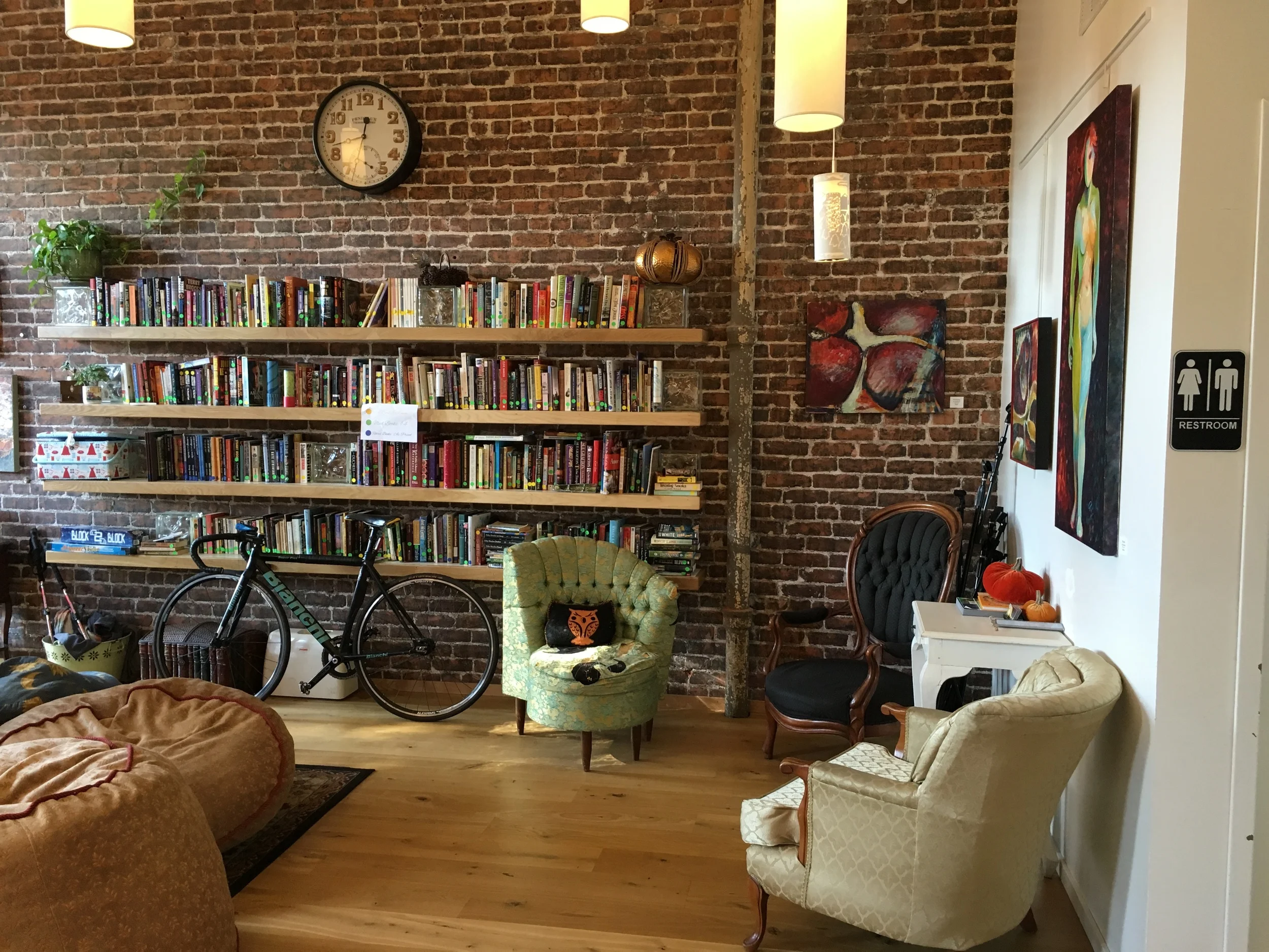
This morning, I had several hours in Point Richmond while waiting for my daughter's class to end. Since I wasn't able to do a detailed interior sketch yesterday at Tender Greens, I decided to make that a priority today and went to Kaleidoscope Coffee. 

This independent cafe is a major improvement over the Starbucks up the road! Here were my choices for possible views to draw. 

Back of Kaleidoscope Coffee

Back of Kaleidoscope Coffee

Looking from the back towards the front of the cafe

Looking from the back towards the front of the cafe

Looking towards the front

Looking towards the front

Looking back

Looking back

So many great choices! I ended up choosing the view looking towards the back as I had already unpacked a lot of my art supplies on a table in the window in the front (if I finished quickly, I could sketch my view outside the window). Also, this view captures the great kaleidoscope-like artwork on the wall and ceiling. 

I practiced using Steven Reddy's techniques from his Craftsy class, Sketching Interiors: Structure, Detail & Play. First, you need to consider several vantage points from which to sketch, then, make a thumbnail compositional sketch - identifying the foreground, middle ground, and background. Next, you block in the major shapes of your sketch in pencil and then, do a contour drawing of all the tangible edges in your sketch. After that, you apply a series of ink washes (1) a 25% India ink solution over all areas that are not white in your sketch, (2) a second application of the 25% solution over areas that you wish to darken from your first pass, (3) a final application of a 75% India ink solution on the darkest areas of your sketch. 

Here is my sketch after following all of the above steps:

Contour drawing with ink washes

Contour drawing with ink washes

Steven often stops at this stage, but I continued with his two final steps: (1) adding a limited palette of watercolor glazes (which I added to because I don't really like the limited palette effect), and (2) adding hatching for darkest and texture. Here is my final version. 

Final version with watercolor and hatching added.

Final version with watercolor and hatching added.

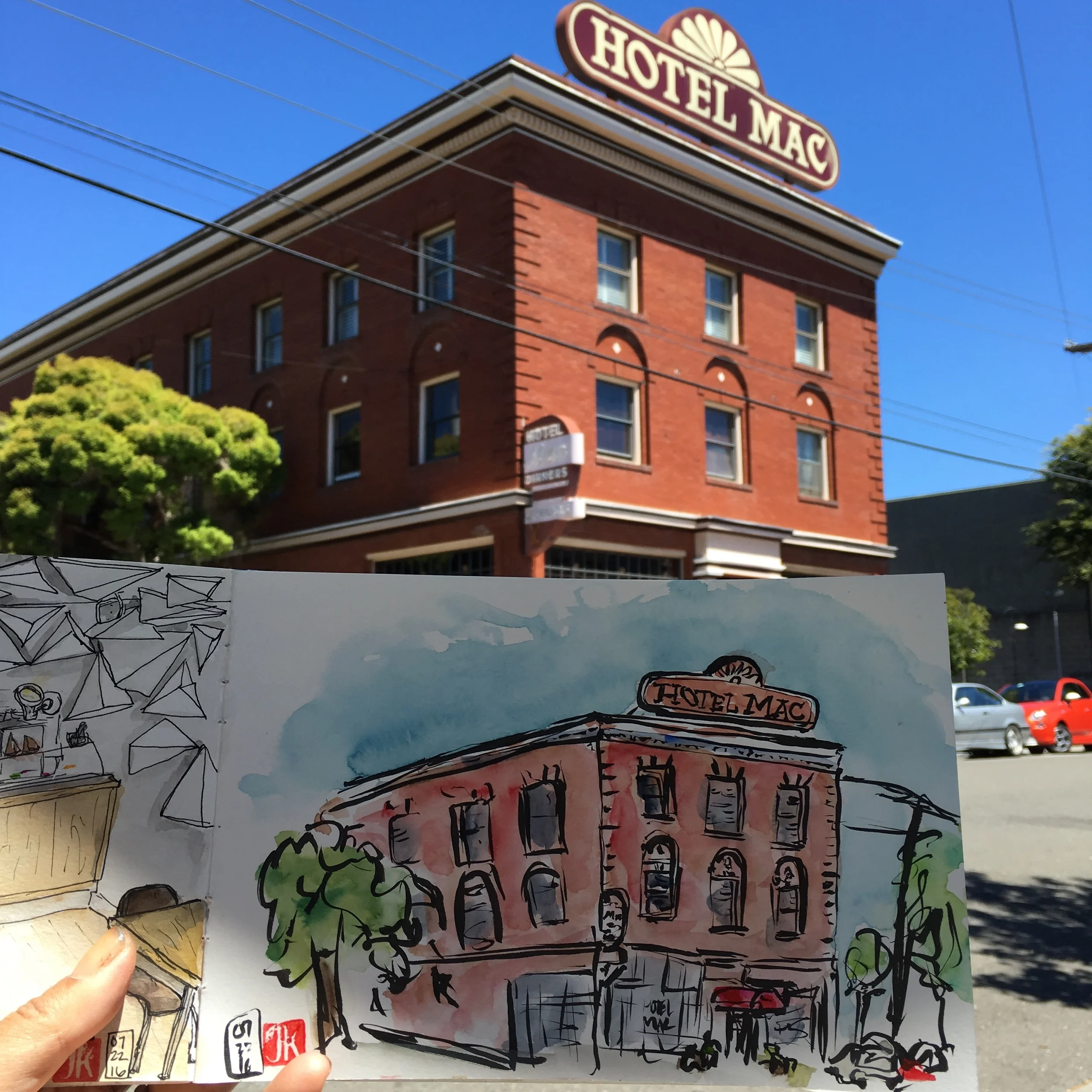
I had about 15 minutes left before I needed to pick up Chloe, so I went outside and did a quick urban sketch using my waterproof Kuretake sable brush pen and my watercolors. This took me about 20 minutes from start to finish and yes, the girls complained when I picked them up 10 minutes late! 

Hotel Mac, Point Richmond, CA

Hotel Mac, Point Richmond, CA

tags: Urban sketching, watercolor, ink, brush pen, craftsy class
categories: Urban sketching
Friday 07.22.16
Posted by Jennie Kessinger
 

All work © Jennie Kessinger 2018. No work may be reproduced or re-posted without the expressed written consent of the artist.   Powered by Squarespace.