After coming back home from the Urban Sketcher's Symposium in Chicago - which was hugely inspiring - I had recommitted myself to getting outside and sketching. But, now that I've been back home for over a month and the kids are back in school, I've decided to get back into sketching some portraits from Sktchy and trying some different styles and media.
Here are some recent pieces inspired by the Sktchy app using watercolor with no underdrawing (for the most part):


I've been enjoying going straight to watercolor with no underdrawing, but I wondered if I shouldn't abandon my older style of drawing first in ink and then adding watercolor. So, I decided to attempt the same portrait in my old style.

Which do you prefer? I've gotten mixed responses on Instagram - with a few more likes for this one with watercolor and ink.
Inspired by James Gurney, I decided to try out using the casein paint set that I picked up at the Urban Sketcher's Symposium in Chicago.

Casein in a milk based paint that used to be very popular with illustrators and designers in the 1930s. It is opaque, yet can also be used watered down like watercolors. It is similar to gouache, yet when it dries, it can be painted over without reactivating the older layers. James Gurney has almost single-handedly brought casein back into modern popularity, so when I saw this 12 color set offered in a wooden box on sale at USK Chicago (at a reduced price from when you can get it for on Amazon), I had to get it!
I struggled a lot with this portrait, but in the end, I quite like it. Another example of needing to quiet my inner critic (monkey).
Next, I tried a technique that James Gurney uses quite often - starting with a casein underpainting and using gouache on top.

Elephants from Sktchy

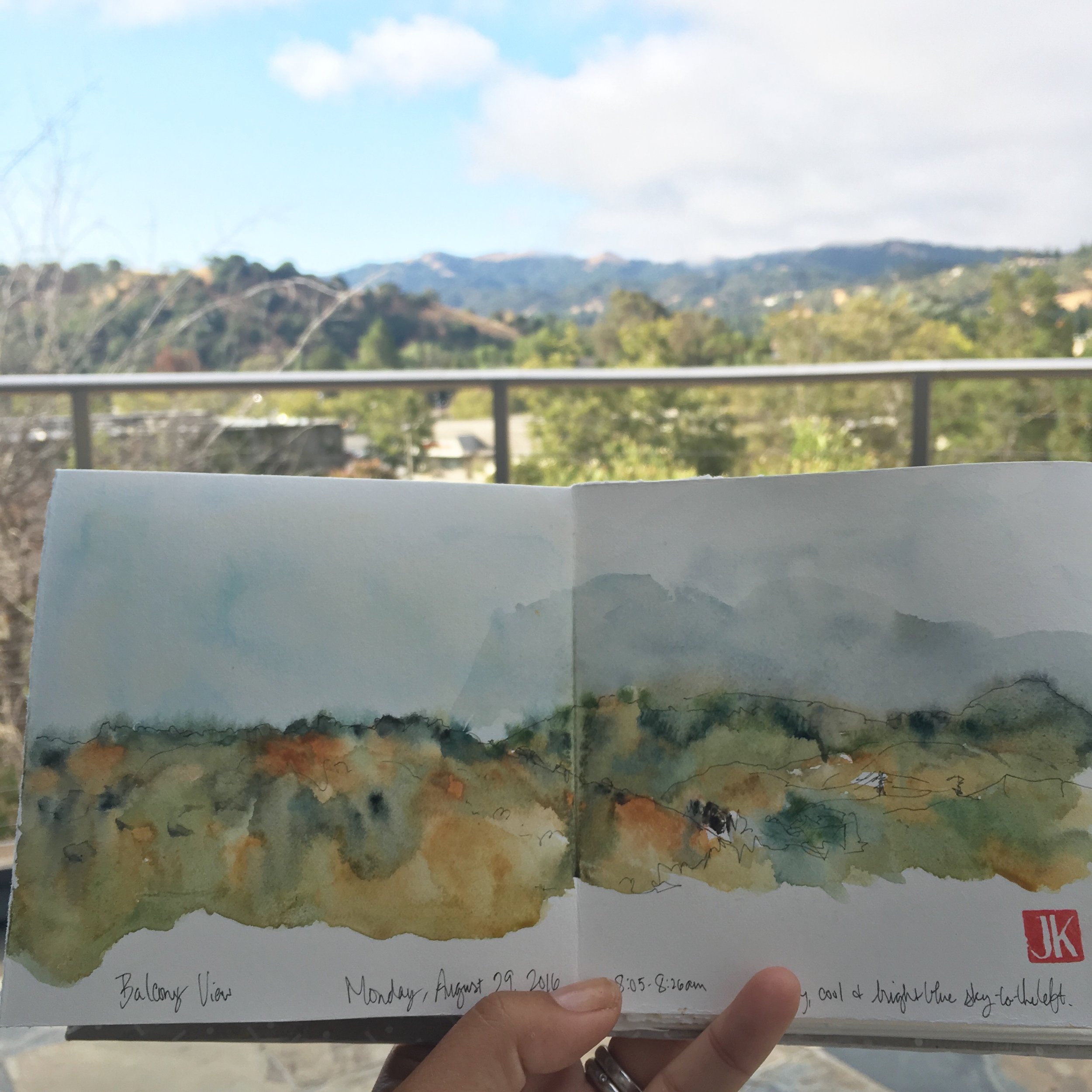
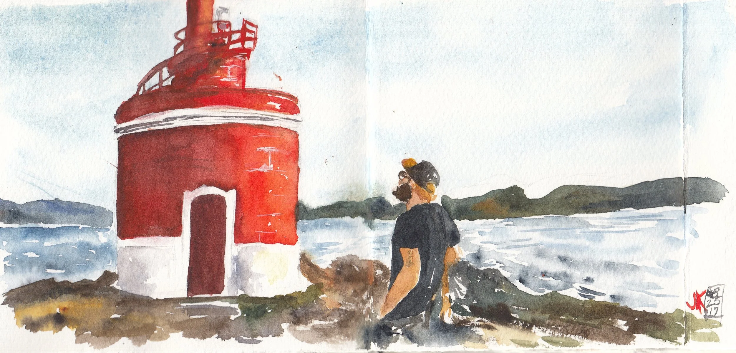
A view of my backyard
I feel like I have so much to learn from all of these different types of media! I definitely love using watercolor, but it is nice to mix it up and use ink with watercolor, or an opaque media like gouache or casein.
What do you think? Do you stick with one primary media? If so, which one? If not, what do you like to use and when/why? I'd love to hear!