Lately, I’ve been revisiting books and artists who inspire me. One such book and artist is The Art of the Affair - An Illustrated History Of Love, Sex, and Artistic Influence by Catherine Lacey and illustrated by Forsyth Harmon. The book is a delightful read - full of information and gossip about writers, artists, and other celebrities from the Jazz Age. But, what I really love about it are the watercolor and ink illustrations by Forsyth Harmon. She uses black pen lines to give definition to the illustrations but does most of her shading with layers of watercolors. Truly inspirational.
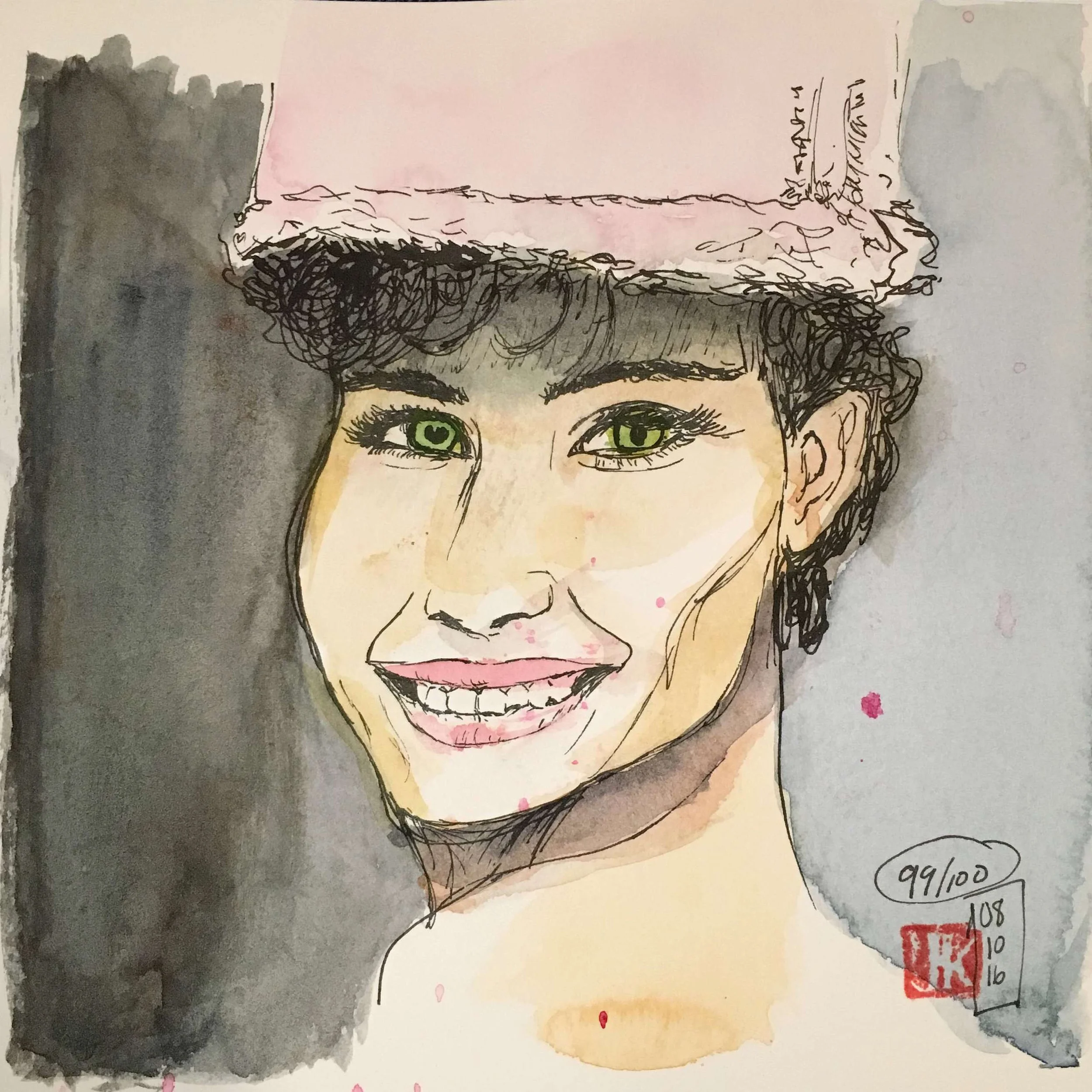
I attempted a few Sktchy-inspired portraits with her style in mind. Needless to say, her style is very difficult to replicate!

My first attempt

My second attempt

For our Christmas card this year
In reasearching Forsyth’s work, I discovered her still lifes on her website. I love these drawings of everyday items that seem to have so much beauty and personality to them. It was so eye opening to me to discover so many subjects for art all around me. I also saw the challenge of finding beauty in things that are so commonplace and ordinary that you never really look at them, much less find beauty in them.
So, I decided to start sketching my everyday items around me - starting with Forsyth’s book.

A digital drawing using Procreate and my Apple Pencil

A favorite snack - also done with Procreate and my Apple Pencil

My handbag

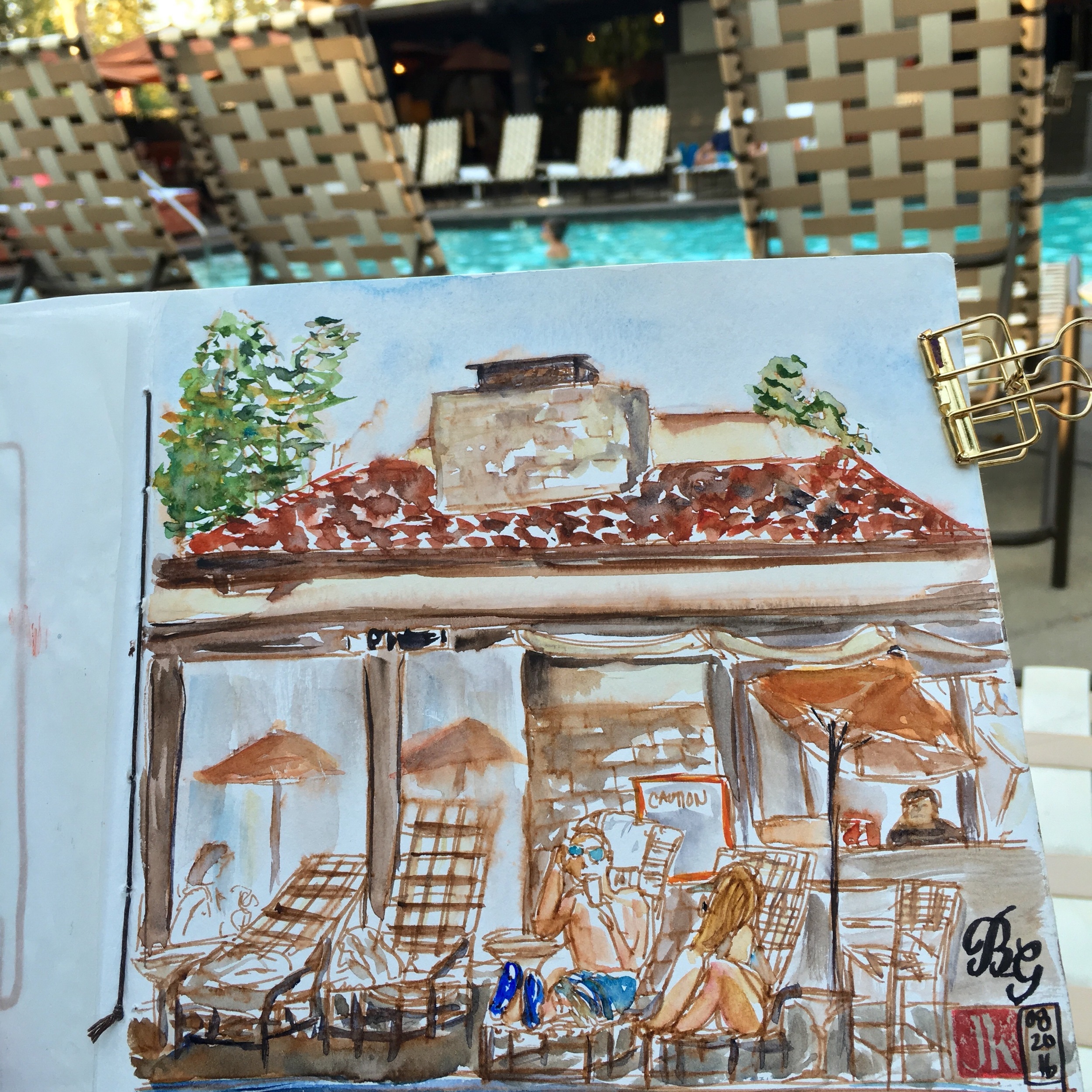
At The Coffee Shop one morning

A box of candy canes

Moose ornaments

More moose ornaments

A nutcracker ornament

More ornaments
I think I am hooked on drawing the everyday items around me! Have you tried drawing the most mundane, boring items around you?
Stay tuned for my next post on working in Procreate and animating my drawings with Sketchbook Motion.