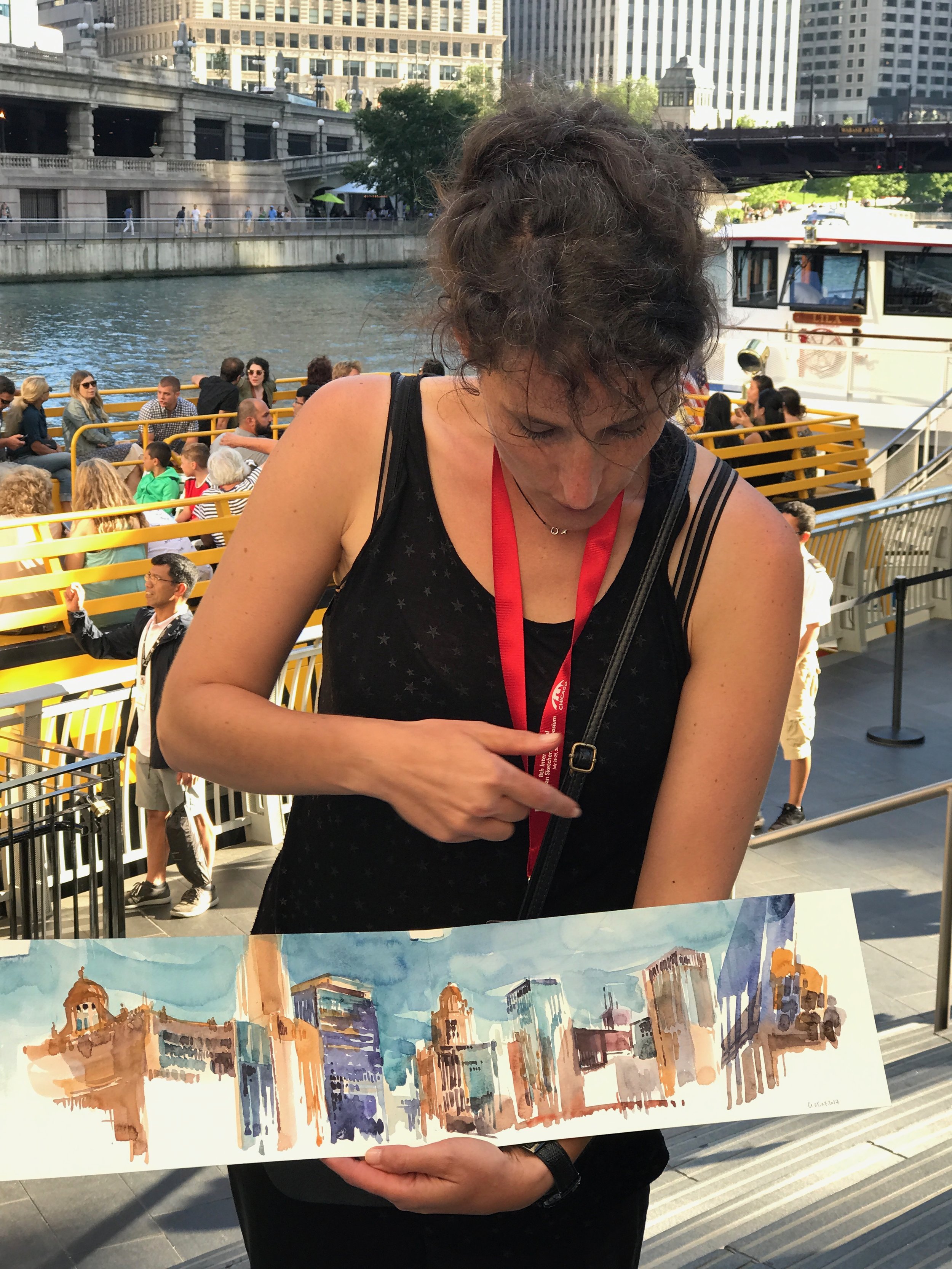
During the Urban Sketcher's Symposium this year in Chicago, I was lucky enough to see Stephanie Bower's Watery Reflection demonstration at the Crown Fountain in Millennium Park.

Designed by Designed by Spanish artist Jaume Plensa, the Crown Fountain in Millennium Park is a major addition to the city's world-renowned public art collection.
The fountain consists of two 50-foot glass block towers at each end of a shallow reflecting pool. The towers project video images from a broad social spectrum of Chicago citizens, a reference to the traditional use of gargoyles in fountains, where faces of mythological beings were sculpted with open mouths to allow water, a symbol of life, to flow out.
Plensa adapted this practice by having faces of Chicago citizens projected on LED screens and having water flow through an outlet in the screen to give the illusion of water spouting from their mouths. The collection of faces, Plensa's tribute to Chicagoans, was taken from a cross-section of 1,000 residents.
The fountain’s water features operate during the year between mid-spring and mid-fall, while the images remain on view year-round.
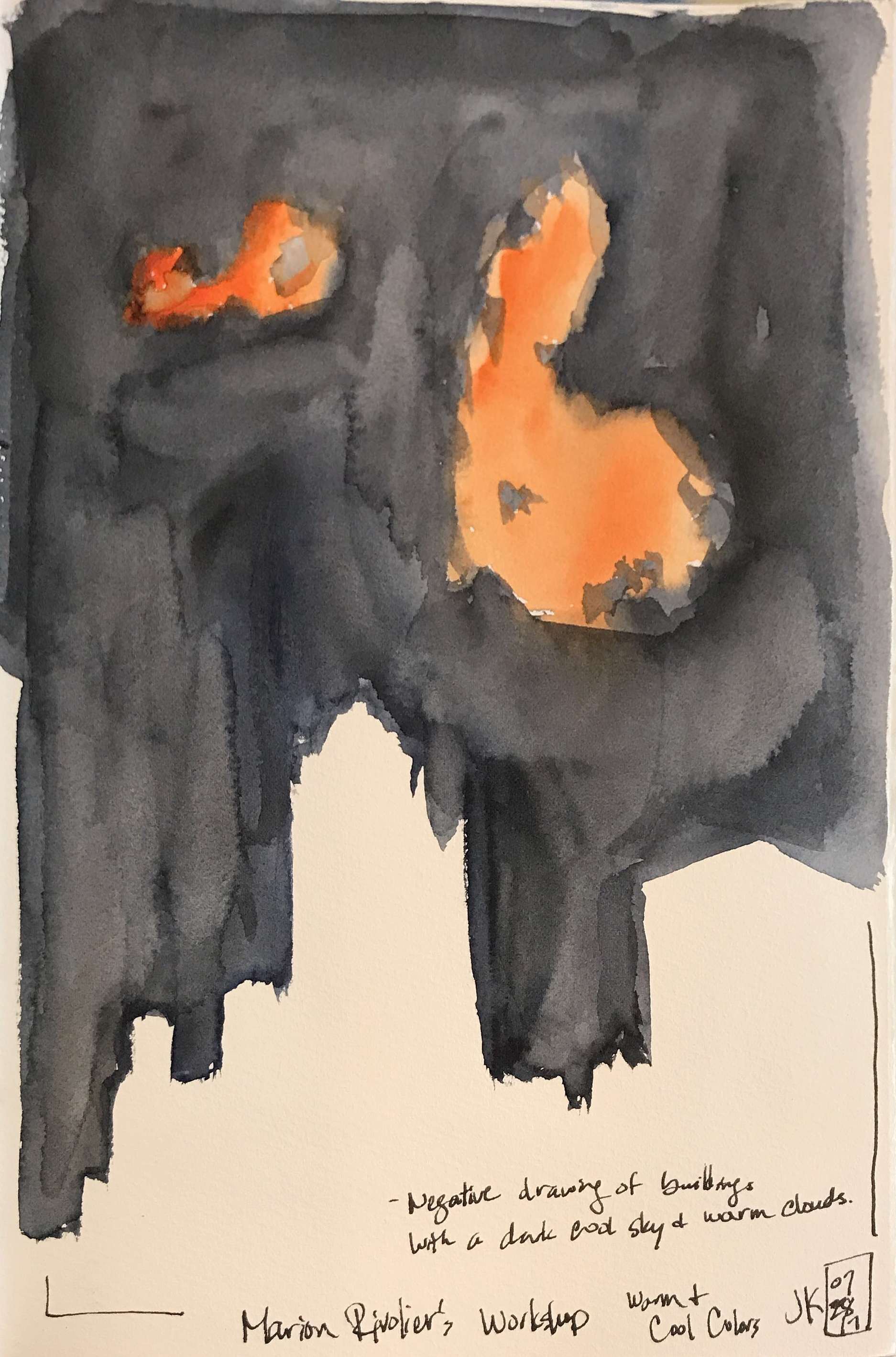
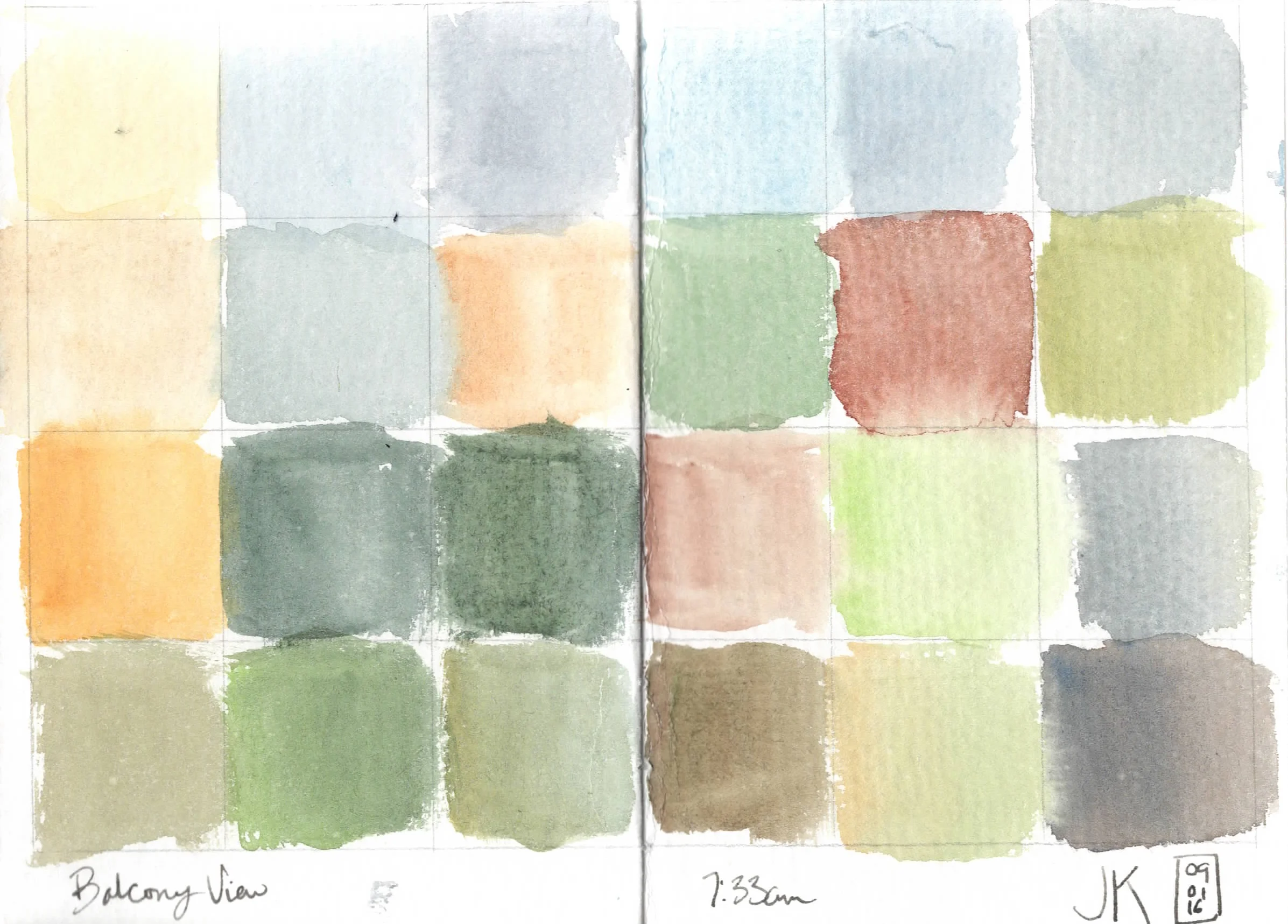
Despite its name, Stephanie's workshop focused on reflections, not just in water - but, also in metals, mirrors, windows, shiny floors, and streets (wet or not). Stephanie passed out a handout that describes how reflections work and different aspects of reflections. With regard to how reflections work, she states that a simple reflection on a smooth surface reflects an image that is the same size and height as the object being reflected and is reflected straight down. She also reminded us that the vanishing point is always at your eye level line - even for the reflected image.
Stephanie showed us some amazing examples of her own work with reflections.
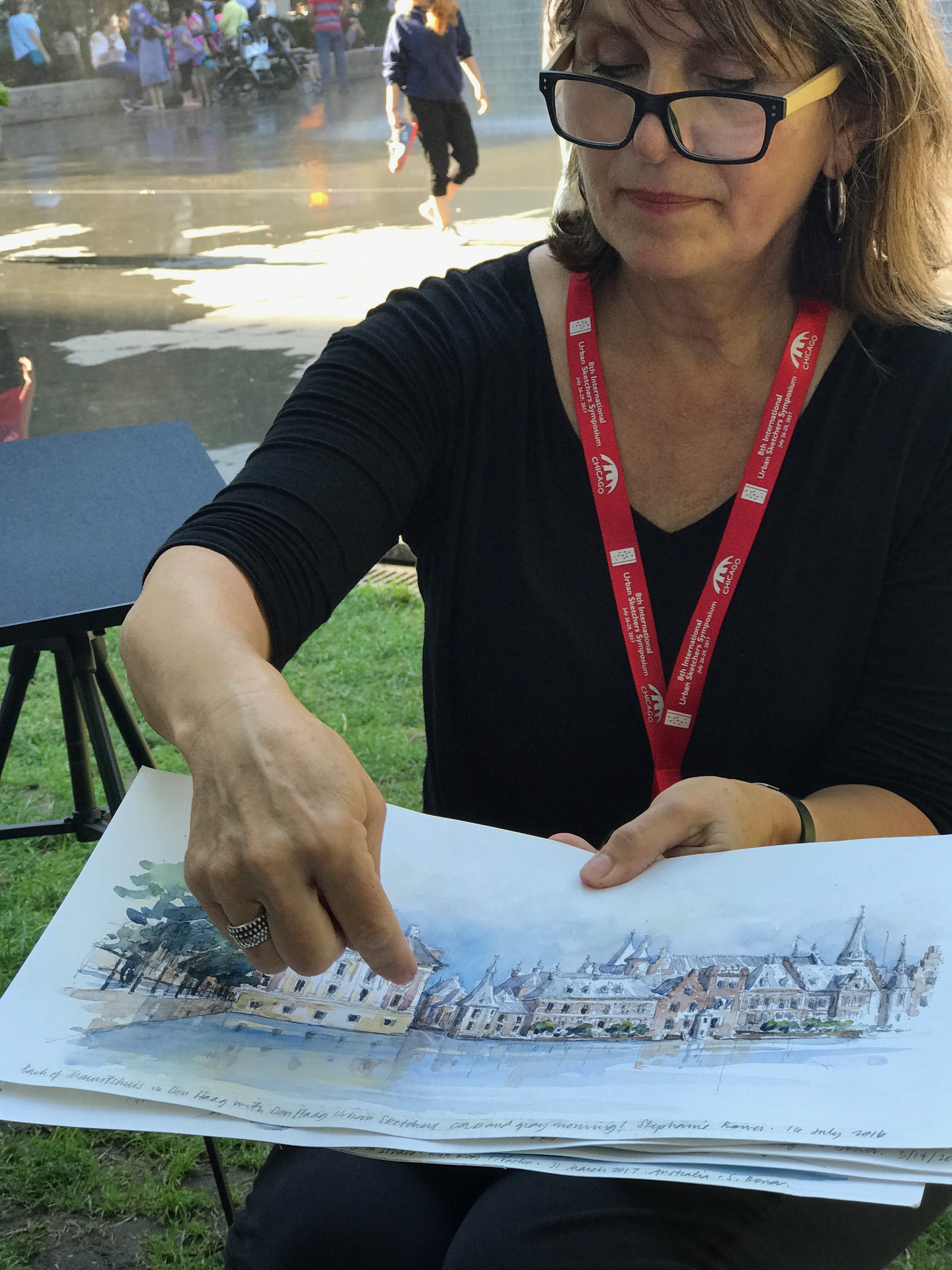

Stephanie's Chicago sketches

Stephanie's sketch with reflections on a shiny indoor floor
But, the best part of this demonstration, was, of course, watching Stephanie sketch the scene in front of us. She started with a quick value thumbnail sketch.
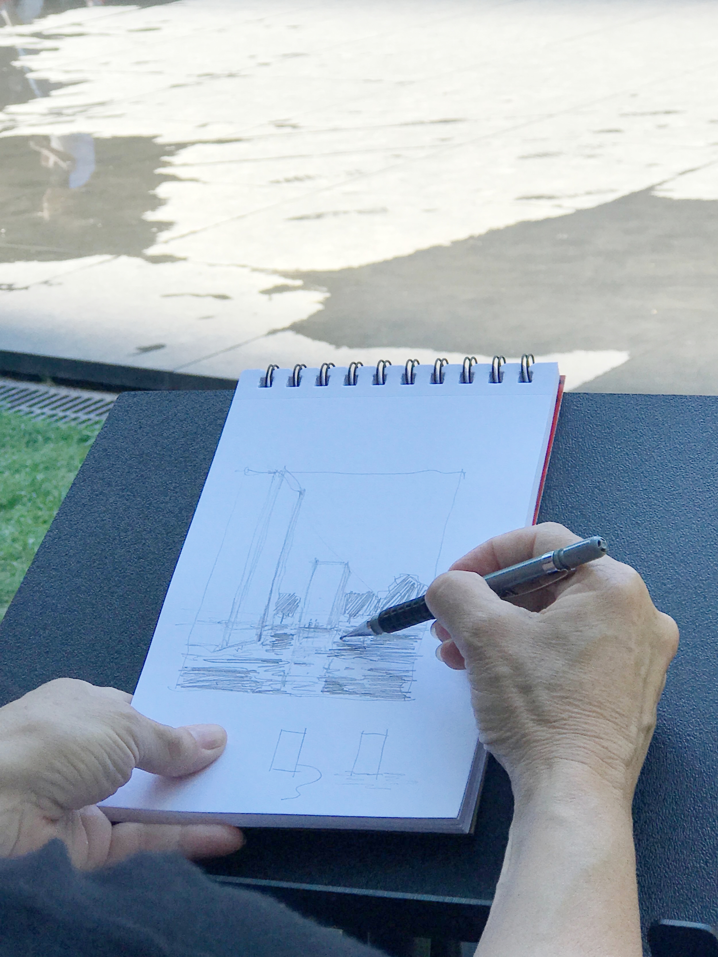
Though Stephanie says she doesn't usually take the time to always make a value thumbnail, it was helpful for me to watch her do it and remember to concentrate on values!
Stephanie then moved on to demonstrate her sketching method with reflections and reminded us to reserve a lot of white space - which she says is always the hardest thing to do! Unfortunately, I didn't get a great video of her process. Here was her sketch:
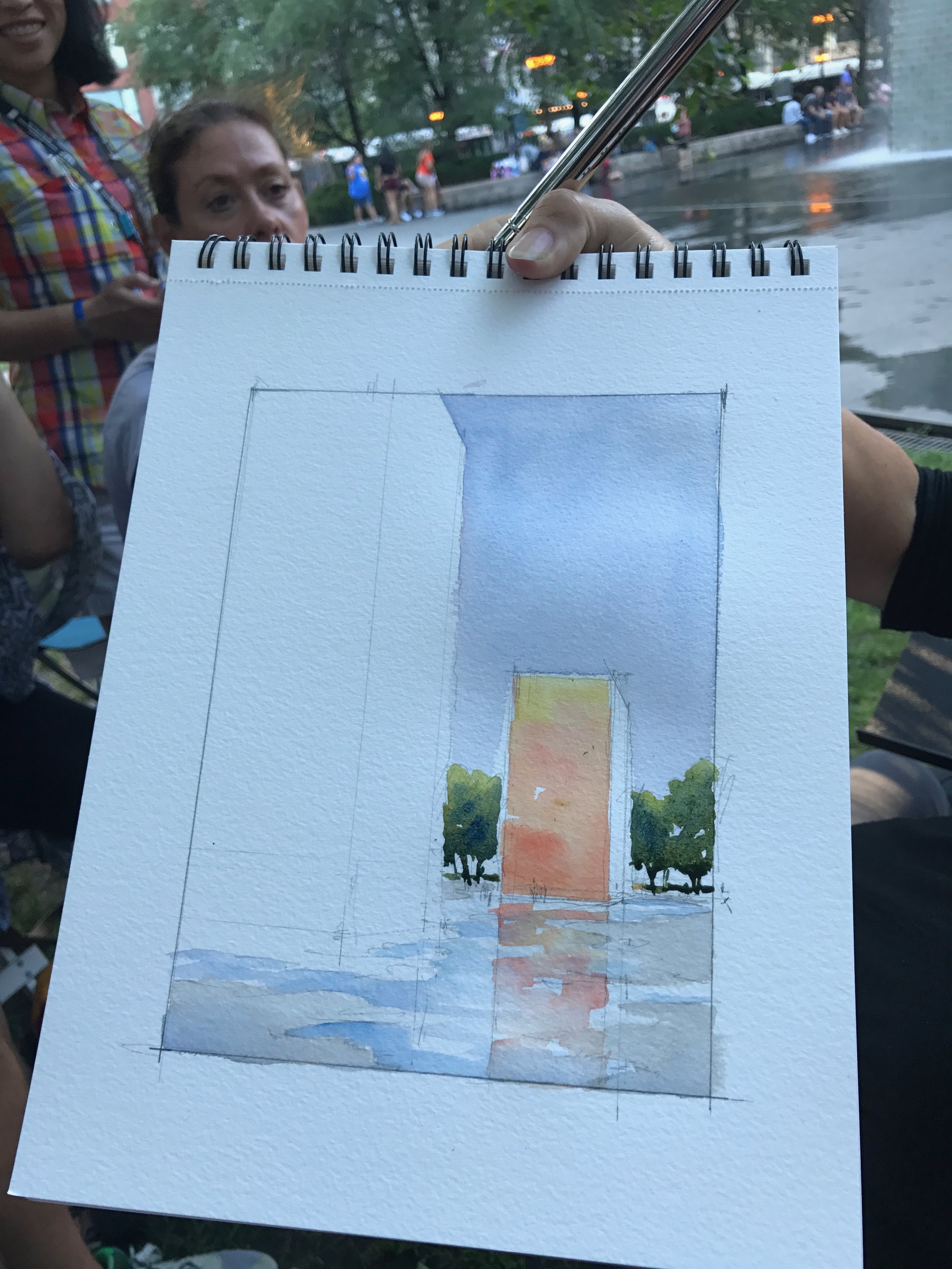

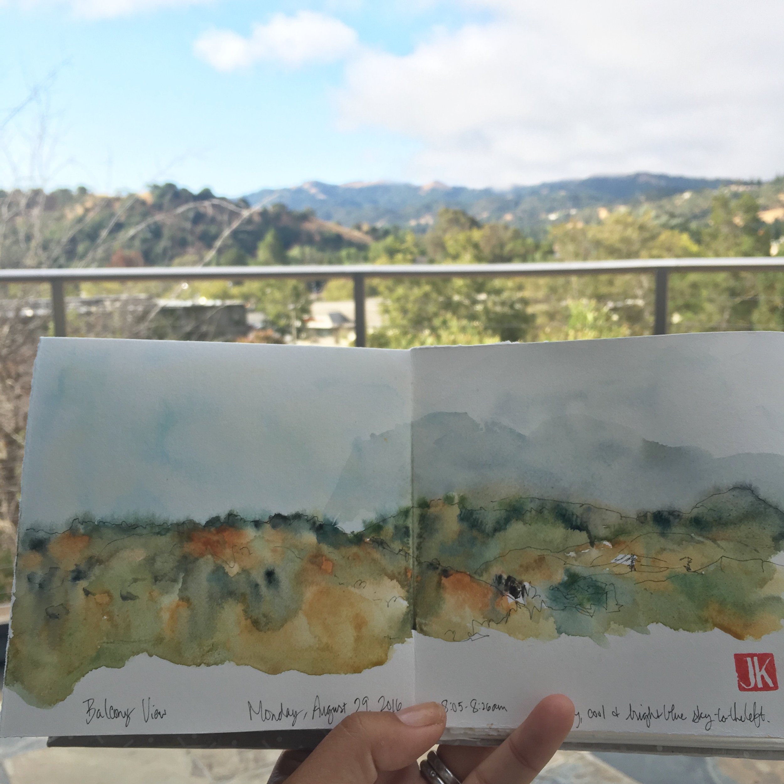
It was an amazing demo to watch - and I'm so grateful for Stephanie to take extra time in continuing her sketch for us. I can't wait to add in more reflections in my work. Recently, I thought of Stephanie's teachings when sketching at the Lafayette Reservoir.

My sketch of the Lafayette Reservoir - I think the reflections really does add to the whole sketch
I really enjoyed Stephanie's demo and intend to add more reflections in a lot of my sketches - and not just ones involving water! Stay tuned for my upcoming blog post on the last workshop I took at USK Chicago - Liz Steel's Lost and Found Structures!