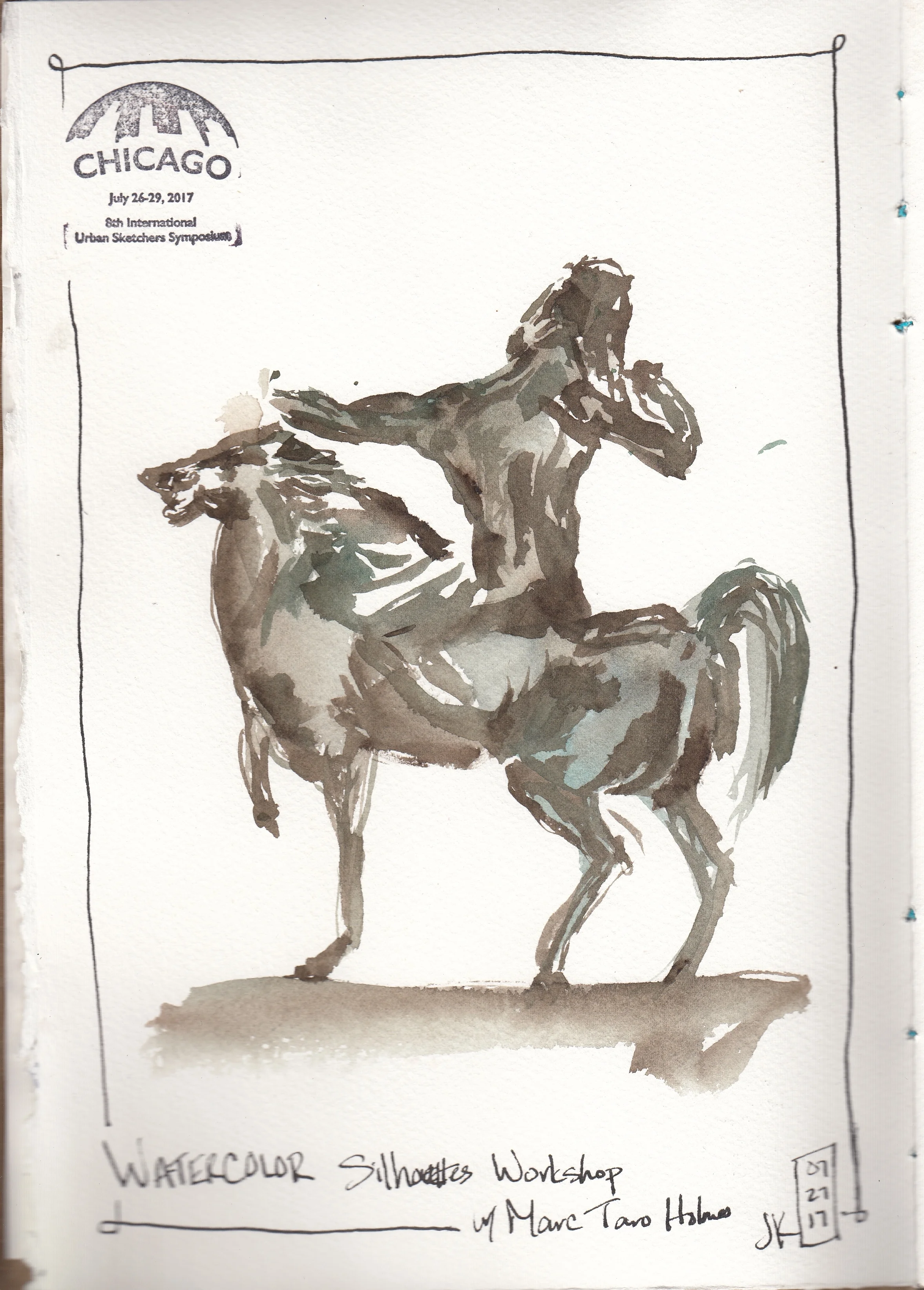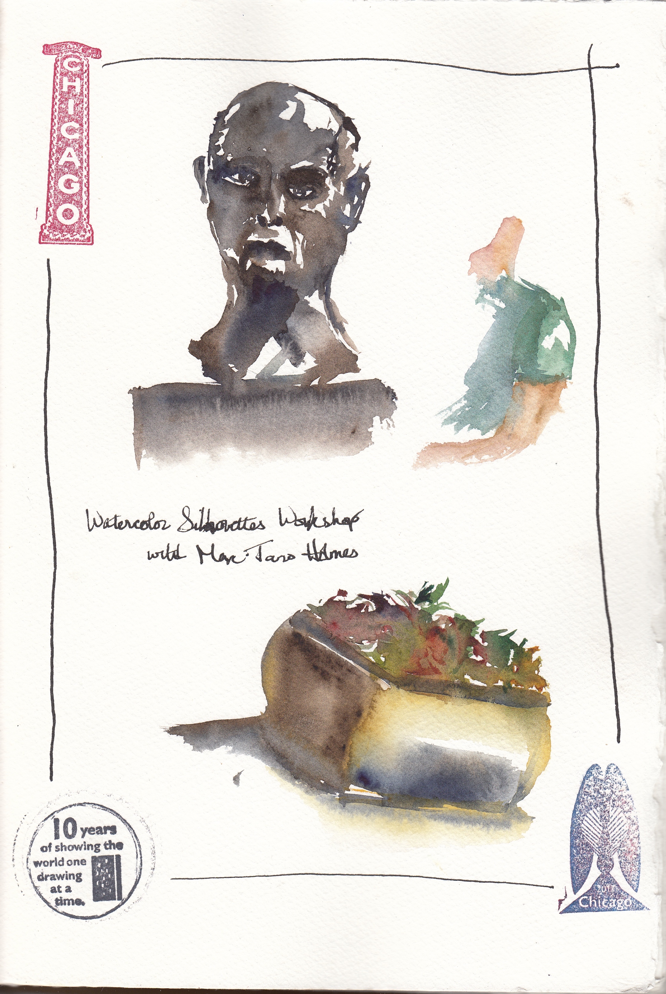
I am so late in finishing my recaps of the workshops I took at Urban Sketcher's Symposium in Chicago. My last workshop was with one of my favorite artists, Liz Steel. This was my last workshop of the Symposium and I was really looking forward to it. Here is the description of the workshop and the handout Liz provided.
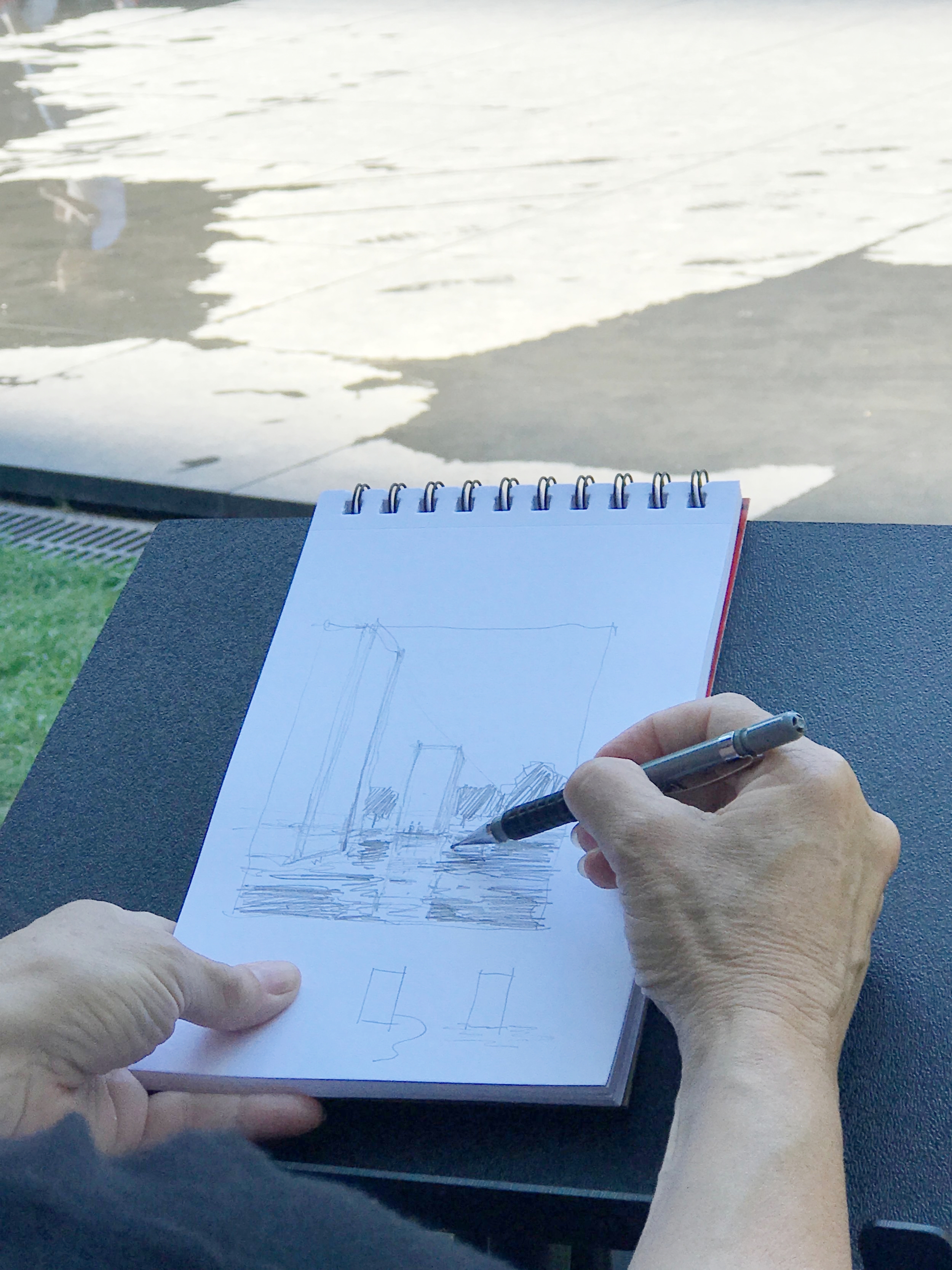
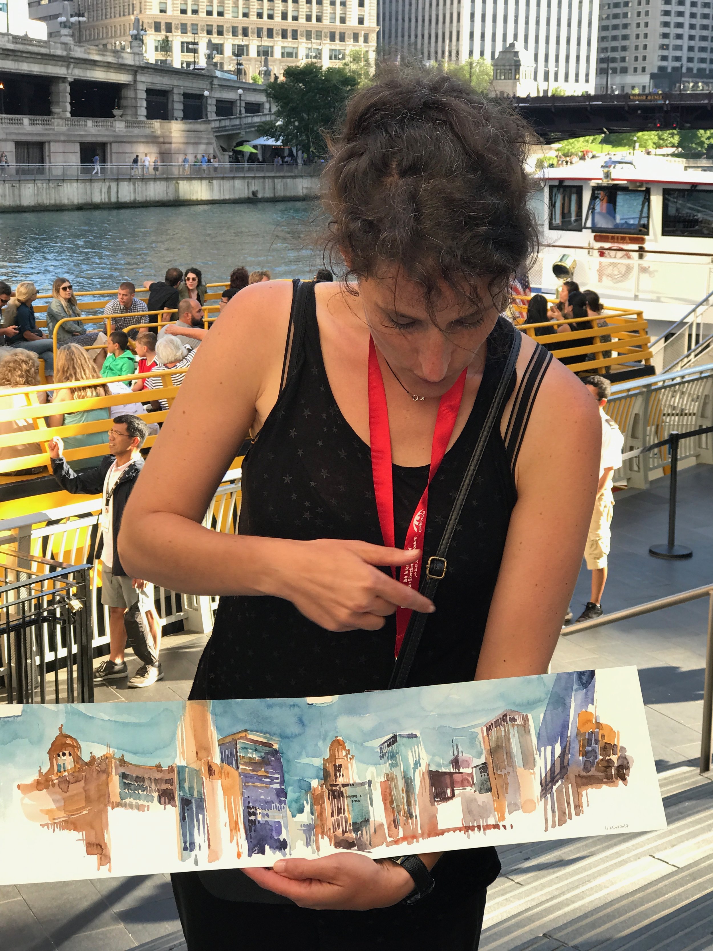
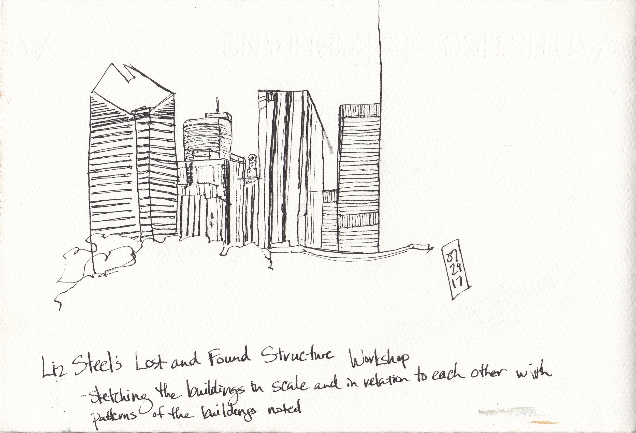
We met Liz and walked to a site near Millennium Park that Liz had selected for its shade and view of several skyscrapers. Liz explained our first exercise, which was to sketch the buildings in scale and in relation to each other - noting the patterns in the buildings - and then demonstrated for us.

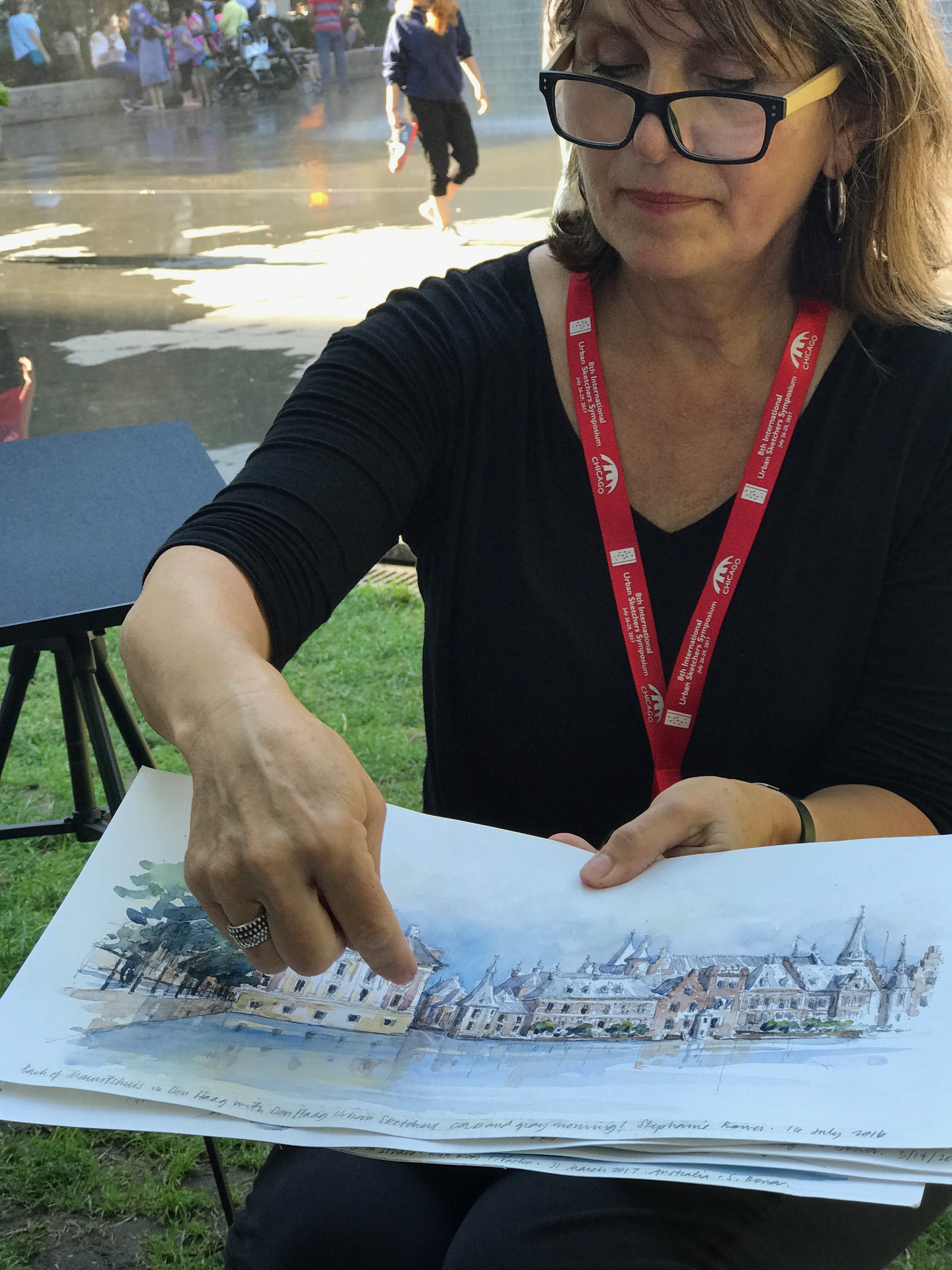
Liz explaining concepts and showing examples from her sketchbook

Here's my attempt:
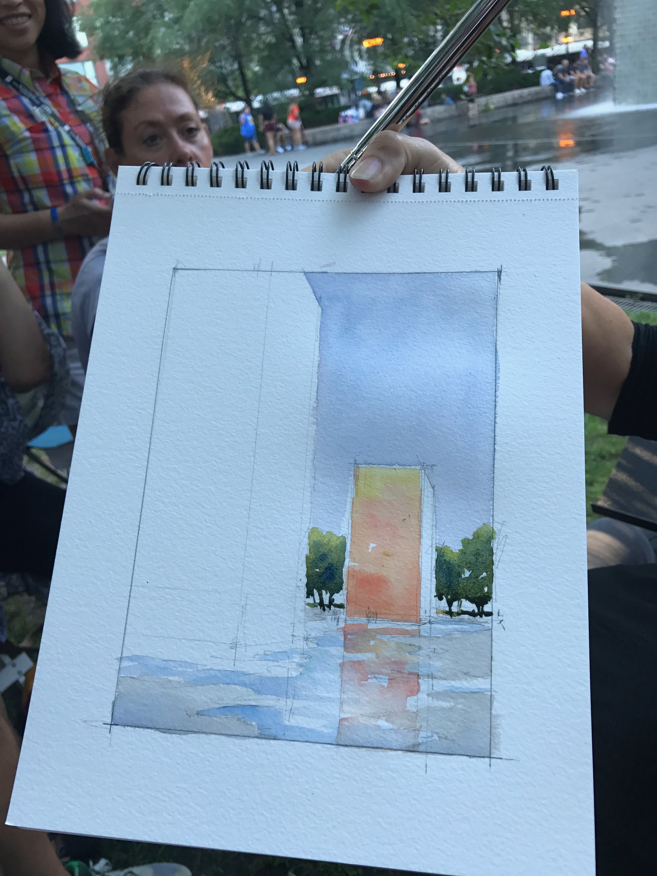
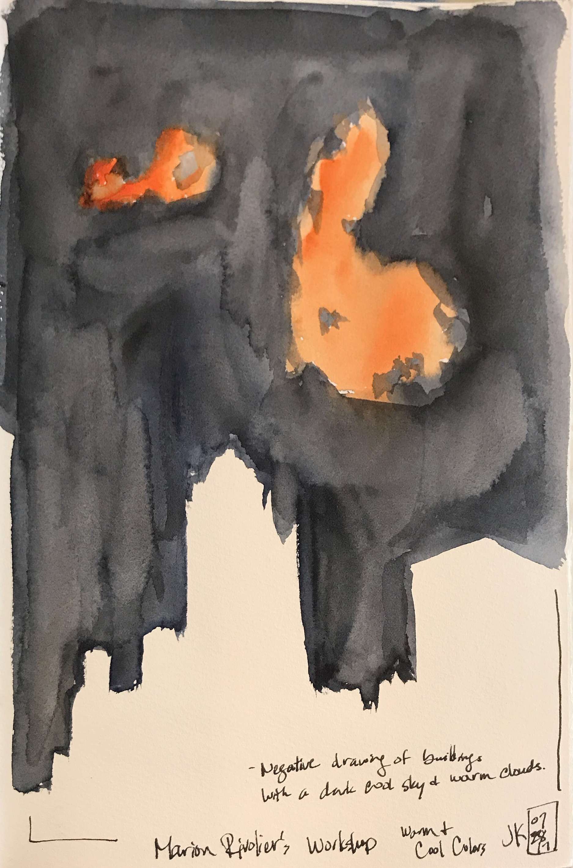
Next, we explored shape by eschewing line altogether and simply painting the shapes of the buildings by using the dominant local color of the buildings. Liz advised us to average out the colors to come up with an overall color for each building.

We then did a line sketch of the volumes and this time add in the darks only. Liz told us to review the two sketches and look for areas where we could merge shapes. Are they in the same place for both sketches?

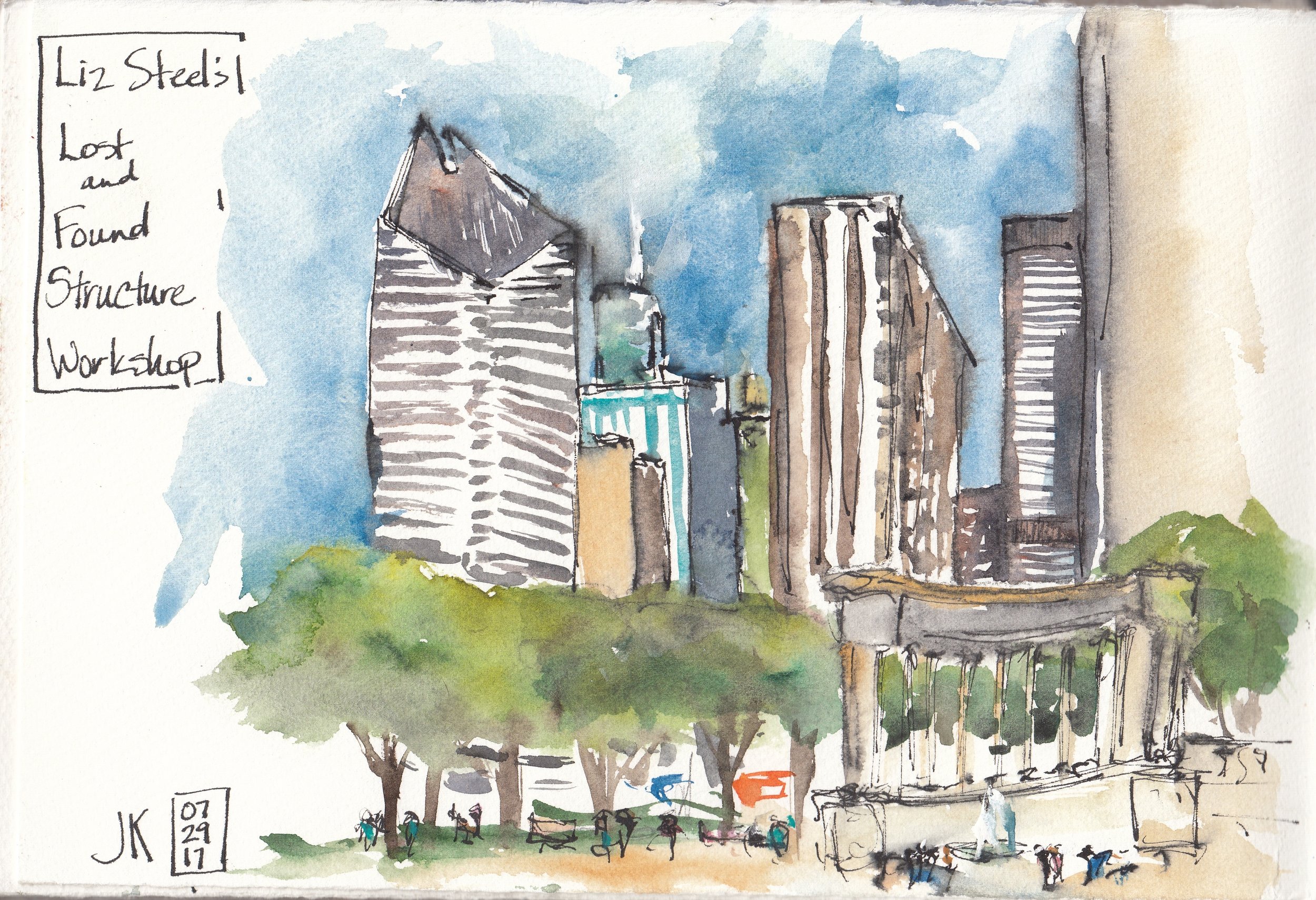
Finally, we were tasked with putting it all together by starting our final sketch by painting some (not all) of the big shapes using either local color or shadow areas. After a few shapes, she told us to switch to adding structure either in pen or in paint. Whenever possible, Liz advised us to blow out the highlights, merge together the dark areas, and explore ways of fading the detail of the structure/windows. Here's my attempt and the entire group's.

In the end, it was a wonderful workshop and the 3 hours just flew by! I will have to continue to practice what I learned. But, best of all was just spending time with Liz and watching her sketch! She is such a warm and friendly person and such an inspiring artist.